Visualize marketing data for stakeholders in 2026


Visualizing marketing data for stakeholders is the practice of converting raw marketing metrics into clear, tailored visuals that support fast, confident decisions. The industry term for this discipline is marketing data visualization, and it sits at the intersection of data analysis and stakeholder communication. Done well, it replaces spreadsheet exports with signal-focused dashboards that tell executives what to act on, show clients where their budget is going, and give teams the operational detail they need. The gap between a data dump and a genuine communication tool is where most marketing reports fail, and closing that gap is the core challenge this article addresses.
How to visualize marketing data for stakeholders effectively
Marketing data visualization is defined as the structured translation of metrics, such as cost per acquisition, campaign contribution, and channel performance, into visual formats that match what each stakeholder group actually needs to see. The format matters as much as the data itself. An executive reading a monthly summary needs risk signals and portfolio trajectories, not a table of 400 rows. A client reviewing weekly campaign performance needs budget burn and traffic-light status, not a raw GA4 export.
Effective stakeholder reports include five core elements: a status summary, performance metrics, risks, decisions needed, and next steps. Each element serves a specific communication purpose. Removing any one of them forces the reader to fill in the gap, which slows decisions and erodes confidence.
The shift toward AI-powered dashboards has changed what “effective” looks like in 2026. Modern marketing dashboards now consolidate data from 130+ sources in real time, replacing the manual export-and-format cycle that consumed analyst hours every week. That shift means marketing professionals can spend time interpreting data rather than preparing it.

Which stakeholders need marketing data visualizations?
One-size-fits-all reporting fails every audience it tries to serve. Stakeholders need different levels of detail, and the most common mistake is sending the same report to executives, clients, and internal teams. Each group has a distinct job to do with the data you give them.
Executives and senior leadership
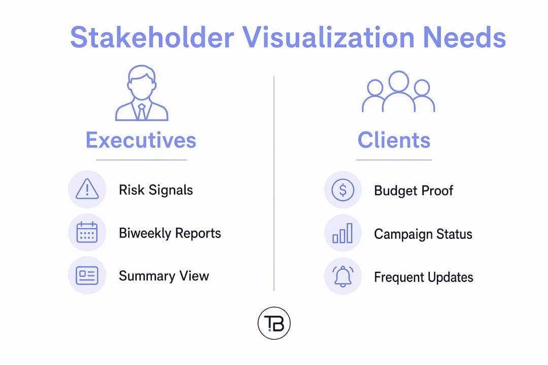
Executives focus on risk and portfolio trajectory. They need biweekly or monthly summaries that answer two questions: “Are we on track?” and “What decisions do I need to make?” The most effective format for this group is a single-screen report with traffic-light status indicators, budget burn rate, and a clearly labelled “decisions needed” section.
Clients
Clients need proof that their investment is working. Weekly or biweekly updates work best, covering campaign status, spend against budget, and key performance indicators tied directly to their business goals. Avoid internal jargon and operational metrics that have no meaning outside your team.
Internal marketing teams
Teams need granular operational data. Daily or weekly dashboards covering channel-level performance, task completion, and pipeline health give teams the context to adjust tactics quickly. This group tolerates more complexity, but the data still needs to be organised by priority, not volume.
The reporting cadence matters as much as the content. Clients and teams often need weekly updates, while executives prefer biweekly or monthly summaries. Matching frequency to need prevents both information fatigue and the frustration of waiting too long for relevant data.
Common report types to build into your reporting calendar:
What are the best visual formats for marketing data?
Different visualization formats serve different purposes, and choosing the wrong one forces stakeholders to do interpretive work that the visual should have done for them. Bar charts suit comparisons across channels or time periods. Line charts reveal trends over time, making them ideal for showing traffic growth or cost fluctuations. Scorecards give a fast overview of a single metric against a target. Dashboards unify multiple views into one screen, which is where most stakeholder reporting now lives.
FormatBest useStakeholder fitBar chartComparing performance across channels or campaignsClients, teamsLine chartShowing trends over weeks or monthsExecutives, clientsScorecardDisplaying a single KPI against a targetExecutivesDashboardUnifying multiple metrics in one viewAll groupsHeat mapIdentifying patterns across time or geographyAnalysts, teams
Pro Tip: Build separate dashboard views for each stakeholder group rather than filtering a single shared dashboard. Executives see the summary layer; teams see the operational layer. One data source, two tailored outputs.
The move toward AI-native dashboards has added a capability that changes how marketing analysts work. Plain-English natural language querying against raw marketing data means an analyst can type “show me CAC by channel for Q1” and get an immediate visual, without waiting for a pre-built report. That self-service capability reduces the bottleneck between data and decision.
How to implement AI-powered dashboards for stakeholder reporting
AI-native dashboards represent the most significant shift in how marketing teams present data to stakeholders. The core advantage is consolidation. Instead of pulling exports from GA4, your CRM, and your ad platforms separately, a unified dashboard connects all sources and updates in real time. Cross-channel real-time dashboards support live boardroom presentations and interactive data exploration, which means stakeholders can ask questions during a meeting and get answers immediately.
The practical benefits of this approach include:
Setting up this kind of infrastructure requires connecting data sources securely and defining a consistent metric logic before building any visuals. Tech Business Development specialises in automated marketing analytics workflows that connect GA4, CRM platforms, and ad accounts into a single reporting layer, removing the manual work that slows most marketing teams down.
Pro Tip: Define your metric logic in writing before connecting data sources. Agree on how “conversion” is counted, which attribution window applies, and which channels are included. Ambiguity at the definition stage creates distrust at the reporting stage.
What are best practices for presenting marketing data to stakeholders?
The most common failure in stakeholder marketing reports is treating them as data delivery rather than communication. Executives want risk signals and decisions needed, not detailed task-level data. Every visual in a stakeholder report should answer one question before the reader has to ask it.
“Treat marketing reports as communication vehicles focused on signalling key portfolio trends and decision points to stakeholders rather than data dumps. The report’s job is to reduce the cognitive load on the reader, not increase it.”
Three practices separate reports that build confidence from reports that create confusion:
Common mistakes to avoid: sending the same report to every audience, burying the key finding on page four, using internal acronyms without definitions, and presenting data without a recommended action or decision.
For a deeper look at how marketing analytics best practices apply across consulting contexts, Tech Business Development’s 2026 guide covers the full reporting cycle.
What challenges arise in marketing data visualization and how do you fix them?
Marketing professionals encounter predictable obstacles when building stakeholder reporting systems. Knowing the fix before the problem appears saves significant time.
Pro Tip: Run a quarterly report audit. Ask each stakeholder group which sections they actually read and which they skip. Cut the sections nobody reads and add depth where engagement is highest.
Key takeaways
Effective marketing data visualization requires tailoring every report to its audience, using auditable metric logic, and replacing static exports with real-time dashboards.
PointDetailsTailor reports by audienceExecutives need risk signals; clients need budget proof; teams need operational detail.Use the right visual formatBar charts compare; line charts show trends; dashboards unify. Match format to the question being answered.Build auditable metric logicTransparent calculations reduce stakeholder scepticism and increase confidence in marketing data.Replace static exports with live dashboardsReal-time dashboards eliminate reporting lag and support live decision-making in meetings.Match reporting cadence to needWeekly updates suit teams and clients; biweekly or monthly summaries work best for executives.
What I have learned from years of stakeholder reporting
The most persistent mistake I see marketing professionals make is confusing thoroughness with usefulness. A 40-slide deck with every metric tracked is not a better report than a single-screen dashboard with five signals. It is a worse one. Stakeholders do not have time to extract meaning from volume. Their job is to make decisions, and your job is to make those decisions easier.
The shift to AI-native dashboards has genuinely changed what is possible. I have seen teams cut their weekly reporting preparation time from several hours to under thirty minutes by connecting their data sources into a unified platform and letting the dashboard do the formatting work. The analyst’s role shifts from data preparation to interpretation, which is where the real value sits.
The lesson I keep returning to is this: ask your stakeholders what they do with the report after they receive it. If the answer is “I look at it and move on,” the report is not driving decisions. If the answer is “I use it to decide where to shift budget,” you have built something that works. Iterate based on that feedback, not on what looks impressive in a slide deck.
How Tech Business Development supports your reporting workflow
Marketing teams that want to move from manual exports to real-time stakeholder dashboards need more than a new tool. They need a connected data infrastructure that pulls from GA4, CRM platforms, and ad accounts without breaking every time a source changes its API.

Tech Business Development builds and automates that infrastructure for marketing teams and business analysts. From GA4 and GTM setup to full workflow automation that cuts manual reporting time by up to 50%, the team handles the technical layer so your analysts can focus on interpretation. If your current reporting process still involves exporting CSVs and formatting slides, Tech Business Development can help you replace it with a system that works in real time.
FAQ
What does it mean to visualize marketing data for stakeholders?
It means converting raw marketing metrics into tailored visual formats, such as dashboards, scorecards, and charts, that match what each stakeholder group needs to see and act on.
What are the most effective visual formats for marketing reports?
Bar charts suit channel comparisons, line charts reveal trends over time, scorecards display single KPIs against targets, and dashboards unify multiple metrics into one view for all stakeholder groups.
How often should marketing reports be sent to stakeholders?
Reporting cadence varies by group: clients and internal teams typically need weekly updates, while executives prefer biweekly or monthly summaries to avoid information fatigue.
How do AI-powered dashboards improve stakeholder reporting?
AI-native dashboards consolidate 130+ data sources in real time and support plain-English queries, removing manual export work and enabling live data exploration during stakeholder meetings.
How do you build stakeholder trust in marketing data?
Use transparent, auditable metric logic that shows how each number is calculated. Auditability reduces scepticism and gives leadership the confidence to act on marketing insights.